Basics
PikaCSS provides a pika() function for writing styles, allowing you to use pure CSS-in-JS syntax without the need to memorize any special class names.
Build-Time Constraint
This is a critical concept in PikaCSS. All arguments passed to pika() must be statically analyzable at build time—no runtime variables or dynamic expressions.
For a comprehensive explanation, see Important Concepts: Build-Time Evaluation.
// ❌ This will NOT work - runtime variable
const userColor = getUserThemeColor()
pika({ color: userColor })

// ✅ Use CSS variables instead
pika({ color: 'var(--user-theme-color)' })
// Then set it at runtime: <div style={{ '--user-theme-color': userColor }}>
Key Points:
- ✅ String literals, object literals, static constants are allowed
- ❌ Runtime variables, function calls, dynamic expressions are not allowed
- 💡 Use CSS custom properties for values that change at runtime
Style Object
The most basic usage is to pass in a style object:
pika({
	// Basic CSS properties
	display: 'flex',
	alignItems: 'center',
	padding: '1rem',

	// Supports camelCase property names
	backgroundColor: '#fff',
	borderRadius: '4px',

	// Supports both numbers and strings
	margin: 0,
	fontSize: '16px',
})
Output Variants
PikaCSS provides variants of the main function to control the output format.
pika.str(...) (Default)
Returns a space-separated string of class names:
const classes = pika.str({ color: 'red', fontSize: '16px' })
// Returns: "a b"
pika.arr(...)
Returns an array of class names. Useful for frameworks that accept class arrays:
const classList = pika.arr({ color: 'red', fontSize: '16px' })
// Returns: ["a", "b"]
pika.inl(...)
For use in template string interpolations. This variant returns void and performs inline string interpolation within template literals:
// pika.inl(...) - Use directly in template strings
const element = `<div class="${pika.inl({ color: 'red' })}">Content</div>`
// Returns: `<div class="a">Content</div>`
Note
pika.inl() returns void and is intended for use directly within template string interpolations. The function applies the class names inline without requiring string concatenation.
Special Properties
PikaCSS supports special properties (prefixed with __) that modify how styles are processed.
__important
Adds !important to all CSS properties in the style object:
pika({
	__important: true,
	color: 'red',
	fontSize: '16px'
})
// Output CSS: color: red !important; font-size: 16px !important;
You can also set __important: false to override a global default (when important.default: true is set in config).
__shortcut
Applies a shortcut by name within a style object:
// If you have a shortcut defined: ['btn', { padding: '10px', borderRadius: '4px' }]
pika({
	__shortcut: 'btn',
	color: 'blue' // Additional styles
})
// Equivalent to: pika({ padding: '10px', borderRadius: '4px', color: 'blue' })
You can also use an array to apply multiple shortcuts:
pika({
	__shortcut: ['btn', 'text-center']
})
Selector Syntax
TIP
PikaCSS supports various selector syntaxes, allowing you to precisely control the scope of your styles. Use the $ symbol to represent the current element's selector.
Basic Selectors
pika({
	'color': 'black',

	// Pseudo-class selectors
	'$:hover': {
		color: 'blue',
	},
	'$:active': {
		transform: 'scale(0.98)',
	},

	// Pseudo-element selectors
	'$::before': {
		content: '"*"',
		color: 'red',
	},
	'$::after': {
		content: '""',
		display: 'block',
	},

	// CSS Combinators
	'$ > span': {
		fontWeight: 'bold',
	},
	'$ + div': {
		marginTop: '1rem',
	},
	'$ ~ p': {
		color: 'gray',
	},

	// Class combinations
	'$.active': {
		backgroundColor: 'yellow',
	},
	'$.disabled:hover': {
		cursor: 'not-allowed',
	},

	// Parent element selectors
	'div > $': {
		margin: '1rem',
	},
	'.container $': {
		padding: '1rem',
	},
})
Note
Each selector will be converted to its corresponding CSS selector:
$:hover→.xxx:hover(xxx is an automatically generated atomic class name)$::before→.xxx::before$ > span→.xxx > span$.active→.xxx.activediv > $→div > .xxx
Nested Structure
TIP
PikaCSS supports multi-level nested syntax, allowing you to freely combine various CSS features:
pika({
	// Regular styles
	'display': 'grid',
	'gap': '1rem',

	// Using selectors within media queries
	'@media (min-width: 768px)': {
		'$:hover': {
			transform: 'scale(1.05)',
		},
	},

	// Using media queries within selectors
	'$:hover': {
		'@media (prefers-reduced-motion)': {
			transition: 'none',
		},
	},

	// Mixing multiple selectors and media queries
	'$.active::before': {
		'content': '"✓"',
		'@media (max-width: 768px)': {
			display: 'none',
		},
	},

	// Feature queries with selector combinations
	'@supports (display: grid)': {
		'$ > *': {
			gridColumn: 'span 2',
		},
	},
})
Note
In the examples above, we demonstrated:
- Nesting media queries and selectors
- Combining multiple selectors (like
$.active::before) with media queries - Combining @supports with selectors
PikaCSS's nested structure allows you to freely combine various CSS features according to your needs.
WARNING
Considering TypeScript's performance, we limit the nesting level to 5 levels, which should be sufficient for most requirements.
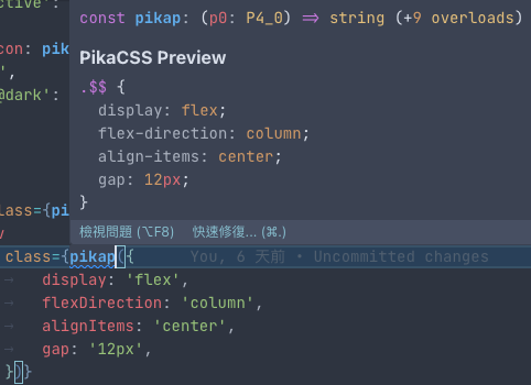
Previewing Styles
PikaCSS provides an IDE preview feature that displays the generated CSS directly in your editor. After saving your file, hover over any pika() call to see a popup showing the generated atomic styles. This uses the auto-generated pikap preview function that is created in your pika.gen.ts file.
INFO
The pikap() function is automatically generated and is intended for IDE integration and hover previews, not for manual function calls in your code. Use pika() for actual style definitions.
Next Steps
Now that you understand the basics, explore these topics:
- Important Concepts - Understand build-time evaluation
- Configuration - Customize PikaCSS for your project
- Shortcuts - Create reusable style combinations
- Selectors - Advanced selector syntax
- Troubleshooting - Common issues and solutions
- TypeScript Support - Full IDE integration